Elana Health (now Peli Health)
My Role: Product Designer
Team: 5 Product Designers, 4 Engineers, 1 Product Manager
Duration: 3 month contract project
Focus: Overall design implementation and strategy to create an intuitive experience that empowers users to make confident decisions regarding their health.

Elana Health is a non-profit focused on pelvic care. Their mission is to provide empowerment, accessibility, and education to help women manage pelvic disorders and to reduce stigma.
Challenges: Women find it difficult to look for pelvic care practitioners and to track their symptoms.
Goals: To create a practitioner marketplace for patients to find and set up appointments. Also, to design a symptom tracker for patients to monitor their health.
Results: A 10 percent increase in new patients signed up with Elana. Also, a high satisifaction rating from practitioners.

Problem: Current website acts as a preview of services and only caters to patients. Users found the site to be lacking in clarity regarding its purpose for practitioners. As a result, users were not willing to sign up for Elana's services.
Solution: A work flow that is streamlined to both patient and practitioner that provides clear onboarding process for services.

Research Phase
Key discoveries from user reasearch:
Health: Health is a top priority
Convenience: Values telehealth services because it saves time
Accessibility: Wants to easily obtain practitioner information
Flexibility: More likely to sign up for services when connecting to practitioner is easily reachable


Competitor Designs
Maven Clinic

Real Self

Gennev

Ideation
Design Concepts and Early Explorations
Must Have
Patient and practitioner sign up page.
Search navigation for a practitioner.
Practitioner profile page to identity background info.
Important
Browse practitioners under area of expertise.
Filter system to find type of practitioner and save time.
Calendar to book appointments or organization.
Could Have
Video for live telehealth to provide users with instant help.
Payment methods for easy checkout.
Blog postings for user to have access to more informational resources.
Design Phase
Home / Landing Page Wireframe
Insights
Wireframes clearly provided individuals with info about Elana and its purpose.
Testing showed there was missing info on how Elana would benefit practitioners. (What a practitioner was signing up for? What are the benefits?)
As a result, testers were not willing to sign up as a new practitioner.


Practitioner Browse Wireframe

Insights:
Users want to “pre-filter” options as much as possible, before investigating practitioner profiles.
Users initially didn’t notice the blog section existed.

Practitioner Sign Up Wireframe
Insights:
How can a practitioner select and indicate that they offer in-person/telehealth appointments? Would it be through the sign-up process?
More info should be provided to a practitioner before signing up.


Practitioner Profile Page Wireframe

Insights:
Users were confused on how to edit each category in their profile.
Users already added some info from the previous sign up prompts, but questioned why it didn’t auto generate on the profile page.
Hi-Fi Prototype Home Page
Insights:
*User testing on the home page layout with the two CTA buttons revealed confusion and decreased trust.
*Users desired more information about what Elana does for individuals and practitioners, before beginning the sign-up process.
Results:
*Created one CTA button primarily for the individual, since they are the use case, and practitioners would utilize their link in the top navigation bar.

Home Page Design Iterations
After the two CTA buttons were removed, the navigation bar links led directly to their respective pages (individuals and practitioners), which simplified the homepage and kept the experience intuitive.


Sign Up Confirmation


Insights:
Users needed a confirmation box stating that their sign up was a success.
New confirmation box was created.
The wording, “Next, let’s set up your profile” and the Create Profile button were added for a better transition to the Practitioner Profile Page.
Practitioner Profile Design Iteration
Insights:
*The Practitioner profile page was overwhelming with an abundance of pencil icons.
*Users found too many steps and windows in order to save the practitioner information.
*Once all the edits on the practitioner profile were made, what was next?
Hi-Fi Continued: Practitioner Sign Up Box

Insight:
*The licensing credentials portion of the sign up registration was consolidated into a single box due to developers’ constraints.
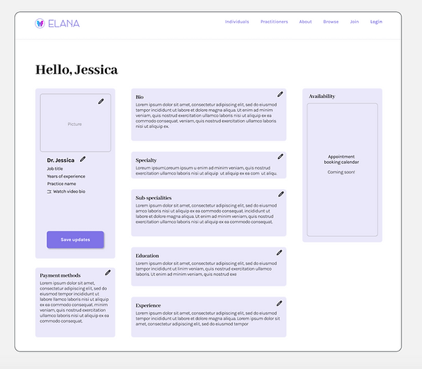
Practitioner Profile: Final Designs

Insights:
*Created hover state boxes to easily edit text input fields.
*Streamlined most important bio info on the left column for fast and easy read.
Insight:
*Created a Log Out for users to have a call to action once editing was complete.
Hi-Fidelity Prototype
(Searching for a Practitioner)
Hi-Fidelity Prototype
(Practitioner Creating a Profile)
Measuring Success
Accomplished: Our team sought out to design a minimal viable product that would provide a resource for women searching for pelvic health practitioners.
Accomplished: Our second goal was to create a space for individuals to connectwith pelvic care practitioners.
While we were able to achieve a majority of these goals, there are still many opportunites for Elana to continue to grow.
Next Steps
*Connect practitioner accounts to social media, so that they can promote their practice with Elana and leverage their reach to new individuals.
*Design a symptom tracker.
*Build the patient side of Elana.
*Implement an appointment calendar for individuals book practitioners.
*Create payment system flows for booking appointments with a practitioner.